“Charts really are the footprints of money.”
― Fred McAllen
What are Chart Patterns?
Stock market chart patterns frequently indicate the transition between rising and falling trends. A price pattern is a distinct configuration of price movement that can be identified using a series of trendlines or formations. Technical analysis is built on patterns, which are the recognisable formations made by the movements of security prices on a chart.
Are you familiar with the terms such as chart patterns, such as Triangle Patterns, Head and Shoulder Patterns, Wedge Patterns, Channel Patterns, Flag Patterns, and so on? Does this term frighten you or make you afraid of missing out on trading opportunities?
No more freaking out and getting lost while trading because you can’t identify such chart patterns. By launching a new pro feature of Chart Patterns – a unique application of Artificial and Human Intelligence – StockEdge comes as a saviour for all those traders who find it difficult to identify chart patterns in stock charts to identify up and down trend patterns with just a click. Now no more investing time in finding stocks forming different patterns.
How to Use Chart Patterns in SE?
StockEdge has developed this unique feature to identify some key chart patterns in stock edge charts for you, where you will receive a list of stocks where respective chart patterns have recently formed, allowing you to capitalise on trade opportunities as soon as a chart pattern is formed.
Before moving to the detailed understanding of our chart patterns, let us first understand the basics of using this powerful feature:
There are 5 categories of chart patterns being provided as of now with 12’ unique chart pattern types covering bullish, bearish and neutral momentum. There are different coloured icons for the varied sentiments:
Green Colour – Bullish Momentum
Red Colour – Bearish Momentum
Orange Colour – Neutral Momentum
There are 2 buttons bars –
Past: Get a list of stocks that have previously formed the respective chart pattern and have likely shown the expected price movement.
Recent: Get a list of stocks that have recently formed the respective chart patterns and is yet to complete the anticipated momentum.
Now let deep dive into the understanding of all Chart Patterns of Stock market.
A line connecting frequent price points, such as closing prices, highs, or lows during a given time period, identifies a pattern. A reversal pattern occurs when a price pattern signals a change in trend direction; a continuation pattern occurs when the trend continues in its current direction after a brief pause.
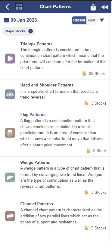
StockEdge provides the following five categories of Chart Patterns:
- Triangle Patterns
- Head and Shoulder Patterns
- Flag Patterns
- Wedge Patterns
- Channel Patterns
Triangle Patterns
Triangle Patterns are among the most common chart patterns used in technical analysis because they occur more frequently than other patterns. A triangle pattern is a chart pattern that denotes a pause in the prevailing trend and is represented by drawing trendlines along a converging price range. Triangles are classified as continuation patterns by technical analysts. Triangles are classified into three types: symmetrical triangles, ascending triangles, and descending triangles. These chart patterns can last from a few weeks to several months.
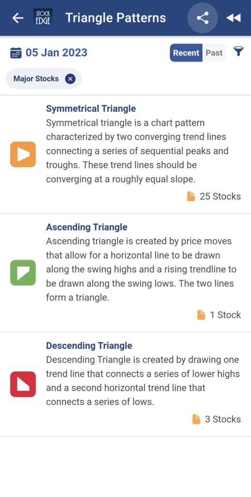
Symmetrical Triangle
A symmetrical triangle is made up of a falling upper trendline and a rising lower trendline. As the price approaches the apex, it will inevitably breach the upper trendline, resulting in a breakout and uptrend on rising prices, or it will breach the lower trendline, resulting in a breakdown and downtrend on falling prices.
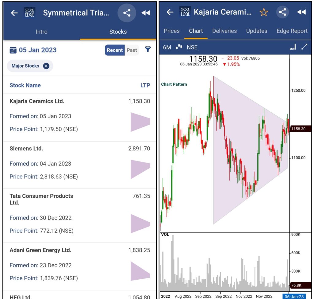
For understanding Trading Strategies and the performance of stocks forming Symmetrical Triangle patterns, Click Here.
Ascending Triangle
An ascending triangle is a breakout pattern that occurs when the price breaks through the upper horizontal trendline with increasing volume. It is a bullish formation. The upper trendline must be horizontal, indicating nearly identical highs that form a resistance level. The lower trendline is rising diagonally, indicating higher lows as buyers patiently increase their bids. Buyers eventually lose patience and rush into the security above the resistance price, triggering more buying as the uptrend resumes. The upper trendline, which was previously a level of resistance, is now a level of support.
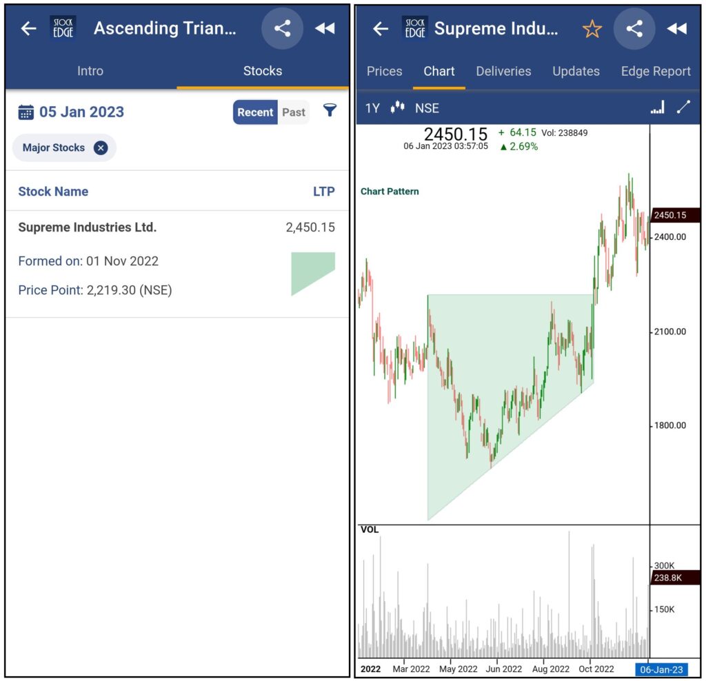
For understanding Trading Strategies and the performance of stocks forming Ascending Triangle patterns, Click Here.
Descending Triangle
A descending triangle is a breakdown pattern that is an inverted version of an ascending triangle. The lower trendline should be horizontal, connecting lows that are nearly identical. The upper trendline slopes diagonally downward toward the apex. When the price falls through the lower horizontal trendline support as a downtrend resumes, the breakdown occurs. The lower trendline, which was previously the support level, is now the resistance level.
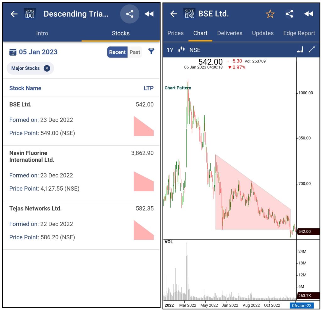
For understanding Trading Strategies and the performance of stocks forming Descending Triangle patterns, Click Here.
Head and Shoulder Patterns
A head and shoulders pattern is a specific chart formation that predicts a trend reversal from bullish to bearish. The pattern appears as a baseline with three peaks, the outside two of which are close in height and the middle of which is the highest. The head and shoulders pattern is considered one of the most reliable trend reversal patterns. There are two types of Head and Shoulders Patterns: Bullish Head & Shoulder Pattern and Bearish Head & Shoulder Pattern.
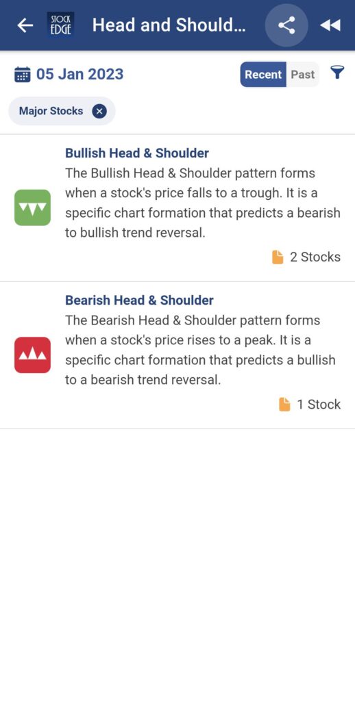
Bullish Head & Shoulder Pattern
The Bullish Head and Shoulders pattern is a reversal pattern that appears after an extended downtrend. The three lows in this bullish pattern resemble an inverted head and shoulders pattern. When the price breaks above the neckline, this is a buy signal. The inverse head and shoulder pattern appears after a long downtrend and indicates the formation of a possible bottom. Volume in the formation of the left shoulder is frequently higher than volume in the formation of the head, confirming that the price is declining with less vigour and may soon find support. As the right shoulder completes, volume often increases, causing the price to advance back up toward the neckline.
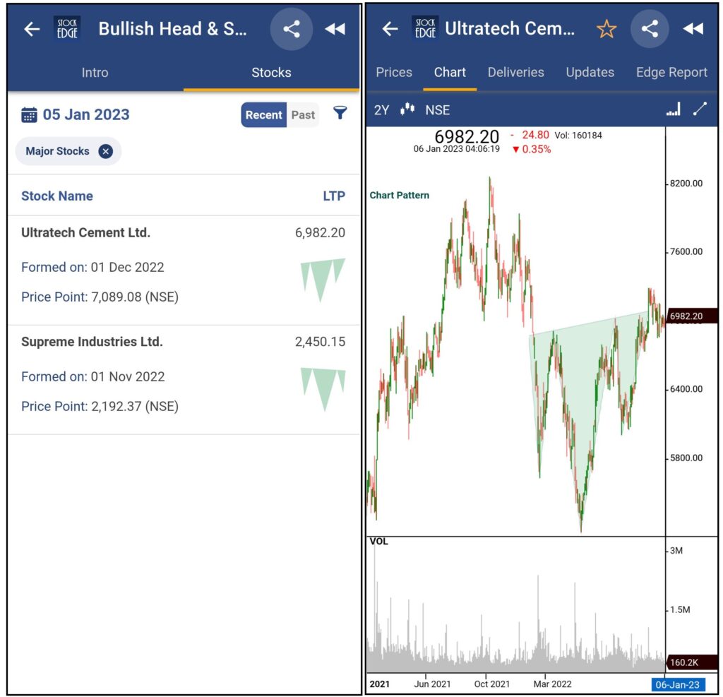
For understanding Trading Strategies and the performance of stocks forming Bullish Head & Shoulder Pattern patterns, Click Here.
Bearish Head & Shoulder Pattern
A Bearish Head & Shoulder pattern is a reversal pattern that occurs after an extended uptrend. The three highs that form a left shoulder, head, and right shoulder give rise to the name of this bearish pattern. When the price breaks below the neckline that forms along the reaction lows, this is a sell or short sell signal. The head and shoulders pattern works best after a long uptrend and provides a stock-topping signal. Volume in the formation of the left shoulder is frequently greater than volume in the formation of the head, indicating that the price is rising with less participation. This is a reliable chart pattern indicating a potential downside reversal.
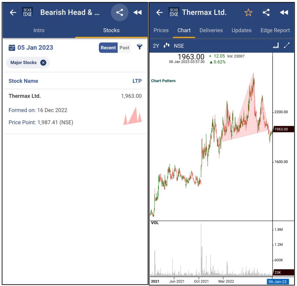
For understanding Trading Strategies and the performance of stocks forming Bearish Head & Shoulder Pattern patterns, Click Here.
Flag Patterns
A flag pattern is a chart continuation pattern that depicts candlesticks contained within a small parallelogram. It is a consolidation zone characterised by a counter-trend move that occurs following a sharp price movement.
When a price that has been rapidly trending suddenly stops and slightly retraces in a rectangular range, the Flag pattern is formed. Then it breaks through that range and keeps moving in the same direction, giving you the chance to enter the second half of a trend at a more advantageous price than it was prior to the flag forming.
There are two types of Flag Patterns: Bullish Flag and Bearish Flag.
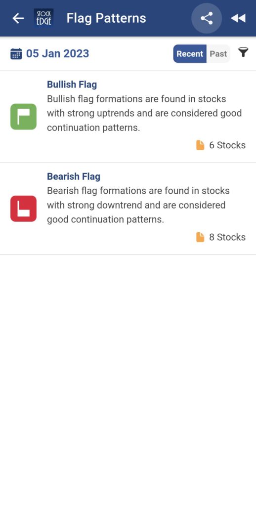
Bullish Flag
An aggressive uptrend is followed by a slow consolidation lower in a bullish flag pattern when prices are moving upward. This suggests that there is more buying pressure driving prices upward than downward, and it also suggests that the momentum will stay positive. On a price chart, a bullish flag looks like an upright flag with a rectangular price pattern identifying it as the flag. The signal is said to be better the tighter the flag is.
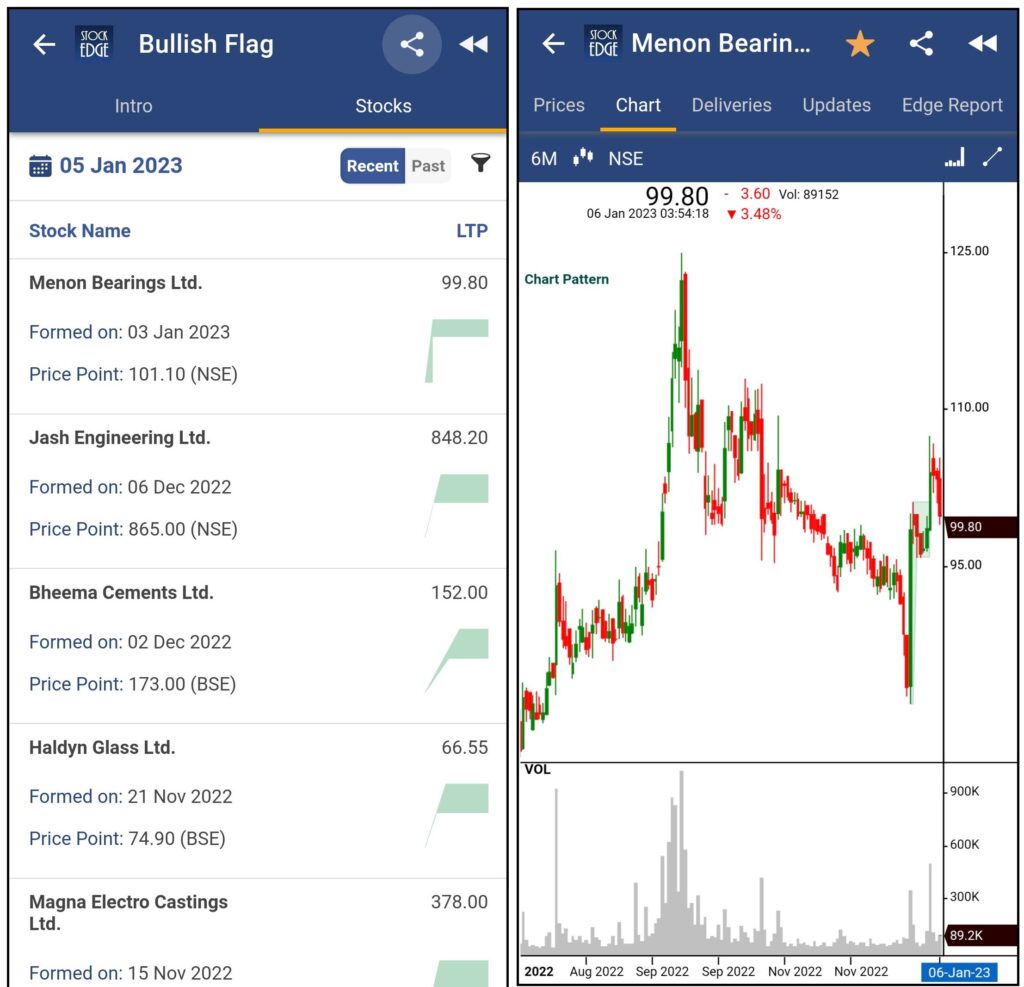
For understanding Trading Strategies and the performance of stocks forming Bullish Flag patterns, Click Here.
Bearish Flag
A bearish flag pattern, which appears when prices are in a downward trend, depicts a gradual uptrend following a swift downtrend. This suggests that selling pressure is driving prices down rather than up, and it also suggests that the momentum will continue to be negative.After this pattern forms, traders wait to enter a short position until the price breaks below the consolidation’s support level.
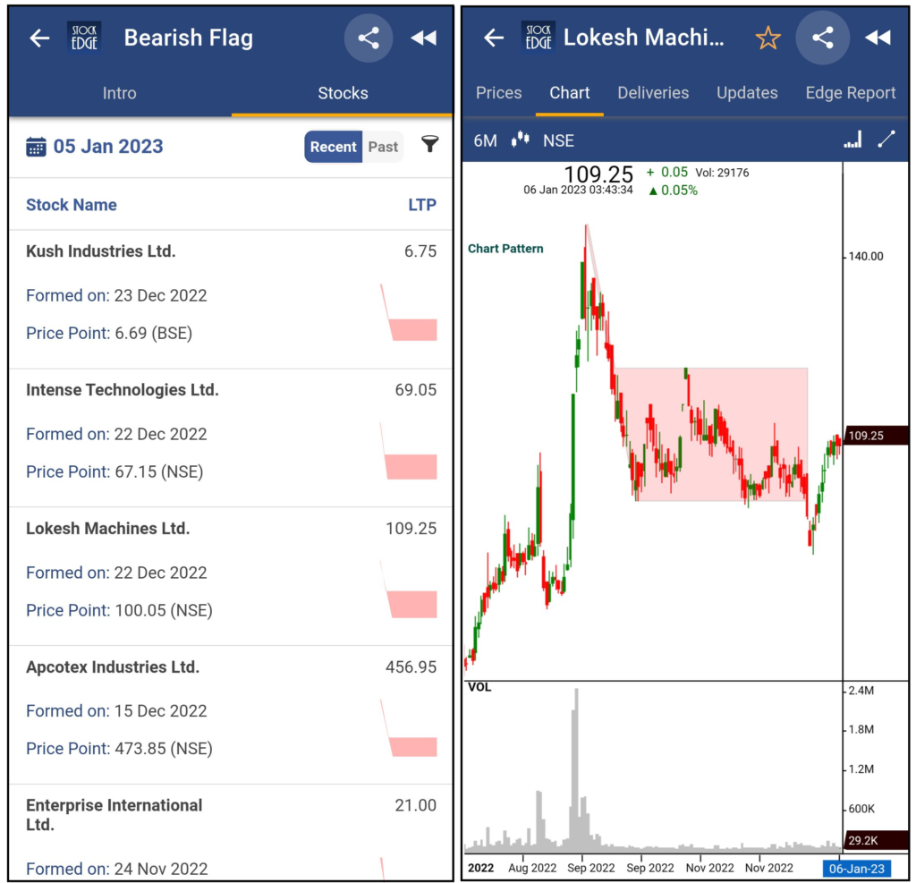
For understanding Trading Strategies and the performance of stocks forming Bearish Flag patterns, Click Here.
Wedge Patterns
A wedge pattern is a type of chart pattern formed by the convergence of two trend lines. Wedges are a type of continuation and reversal chart pattern. The lines show that the highs and lows are rising or falling at different rates, forming a wedge as the lines approach convergence.
A wedge pattern can indicate a price reversal in either direction. In either case, this pattern has three characteristics in common: first, converging trend lines; second, a pattern of declining volume as the price moves through the pattern; and third, a breakout from one of the trend lines. A rising wedge (which indicates a bearish reversal) or a falling wedge (which signals a bullish reversal) are the two types of wedge patterns.
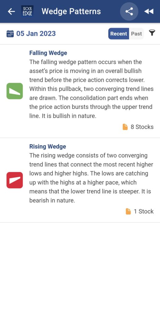
Falling Wedge
When stock prices have been falling for a period of time, two converging trend lines form a falling wedge. Buyers enter the market before the line converges, and as a result, the price decline begins to lose momentum, resulting in a price crossover from the upper trend line.
A falling Wedge in the Uptrend indicates the continuation of an uptrend and a downtrend indicates a reversal of an uptrend.
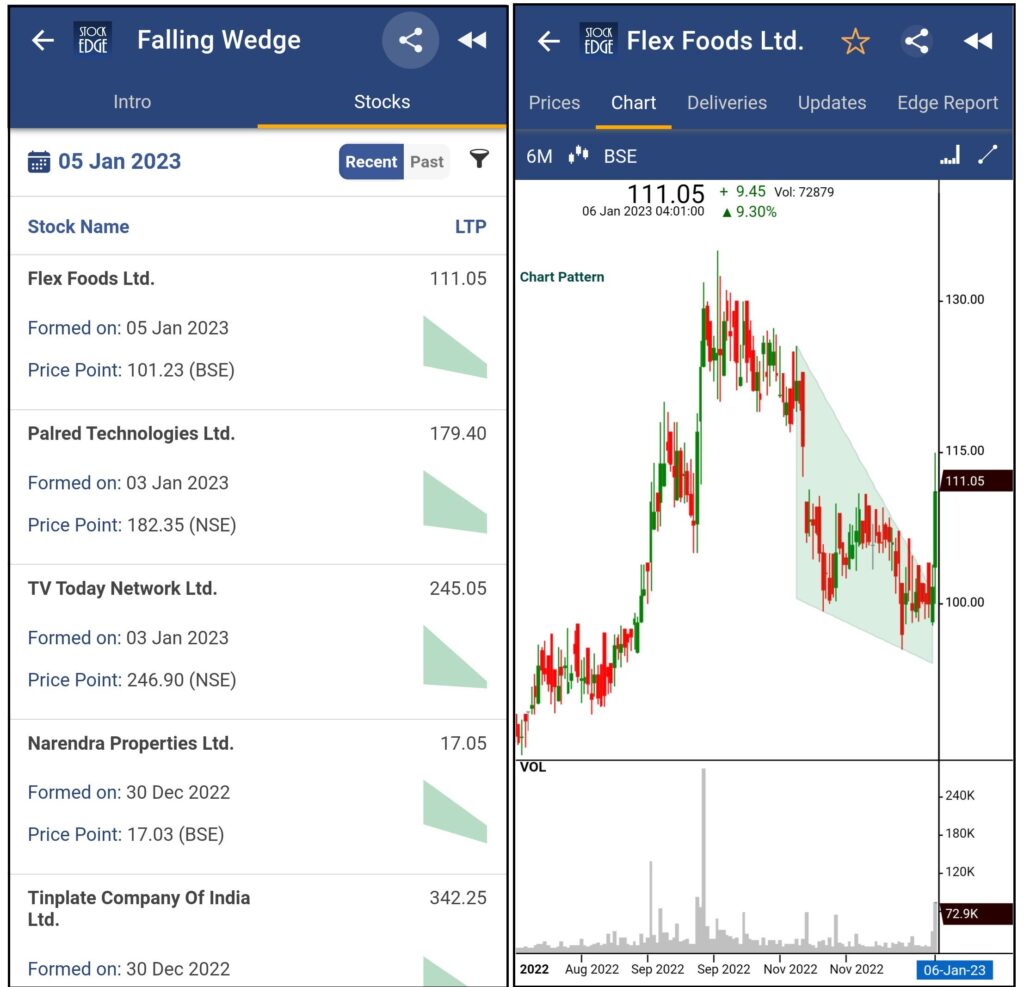
For understanding Trading Strategies and the performance of stocks forming Falling Wedge patterns, Click Here.
Rising Wedge
When stock prices have been rising for a while, two converging trend lines form a rising wedge. Sellers enter the market before the line converges, and as a result, prices lose momentum which causes prices to break out of the upper or lower trend lines, but the prices usually break out in the opposite direction of the trend line.
A rising wedge in an uptrend indicates a reversal to the downtrend and indicates a continuation of the previous trend while in a downtrend.
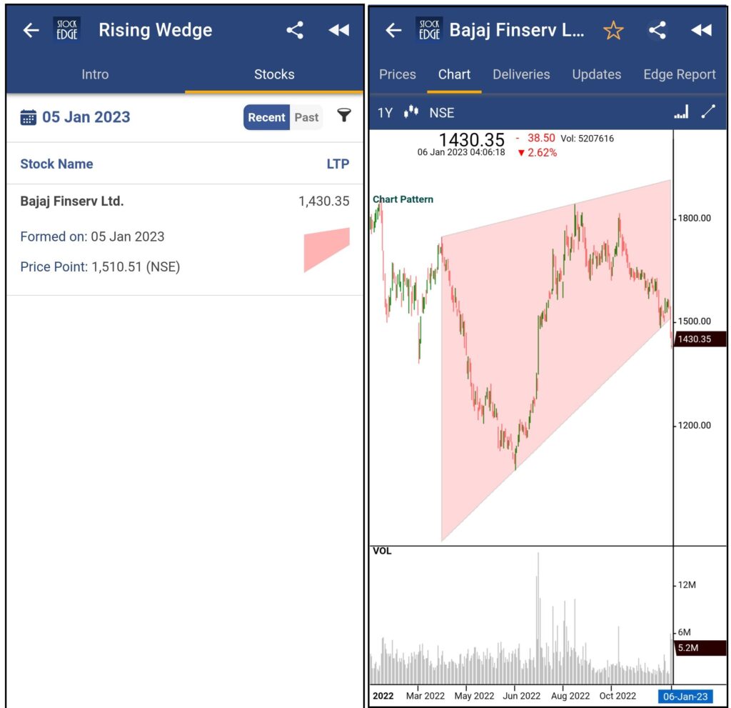
For understanding Trading Strategies and the performance of stocks forming Rising Wedge patterns, Click Here.
Channel Patterns
The Channel chart patterns are continuation patterns created by combining two lines.
When drawn on a price chart, these two lines are parallel to each other and resemble a channel.
The channel’s upper line serves as the resistance line, while the lower line serves as the support line. A channel chart pattern is defined by the addition of two parallel lines that serve as support and resistance zones.
When the direction of a channel is upward, it is called a Rising channel; when the direction of the channel is downward, it is called a Falling channel and when the channel is flat, then it is termed a Flat channel.
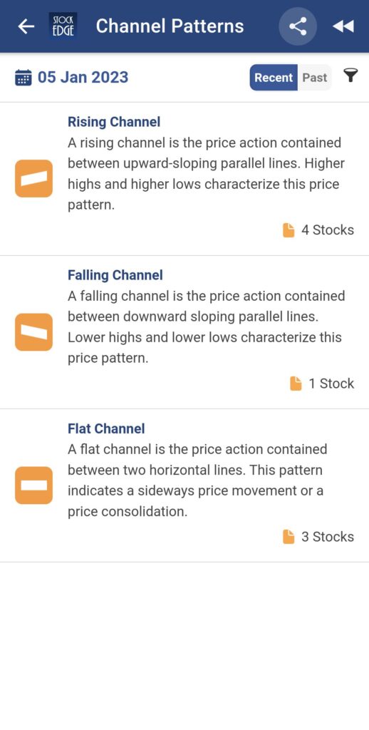
Rising Channel
A rising/ascending channel is defined as the price action contained between two parallel upward-sloping lines. This price pattern is distinguished by higher highs and lower lows. It is made up of two positive sloping trend lines drawn above and below a price series that represents resistance and support levels. Channels are frequently used to confirm trends and spot breakouts and reversals.
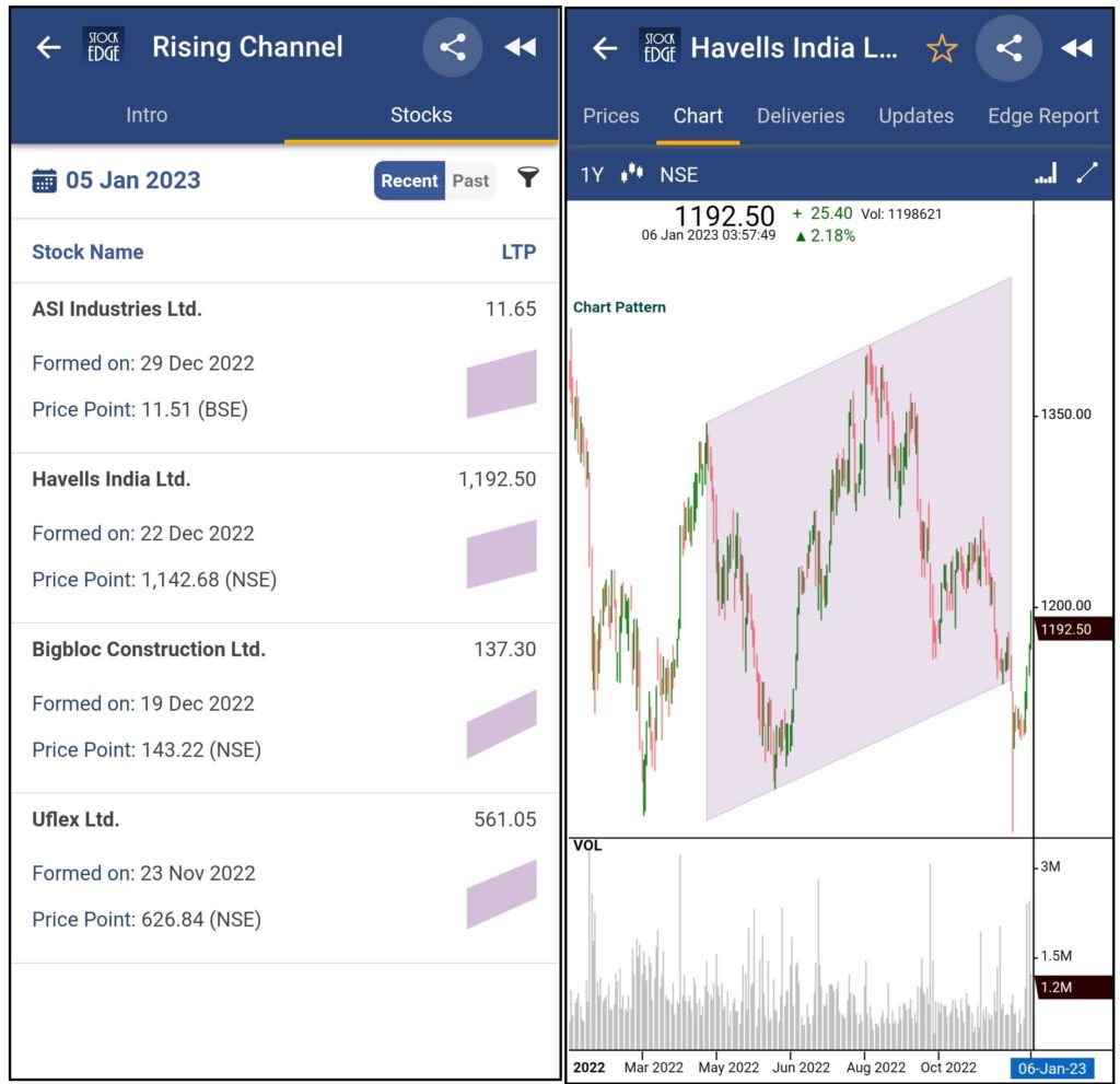
For understanding Trading Strategies and the performance of stocks forming Rising Channel patterns, Click Here.
Falling Channel
A falling/descending channel is formed by connecting a security’s lower highs and lower lows with parallel trendlines to depict a downward trend. Descending channels are used to identify and track security trends over time. The primary falling trend line above the stock connects consecutive lower highs. A secondary trend line is falling beneath the stock, connecting consecutive lower lows.
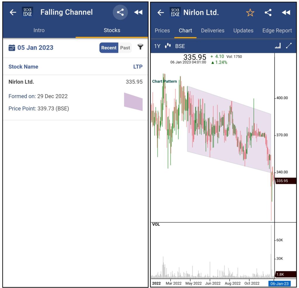
For understanding Trading Strategies and the performance of stocks forming Falling Channel patterns, Click Here.
Flat Channel
A flat channel is defined as the price movement contained between two horizontal lines. This pattern indicates a price consolidation or sideways movement.
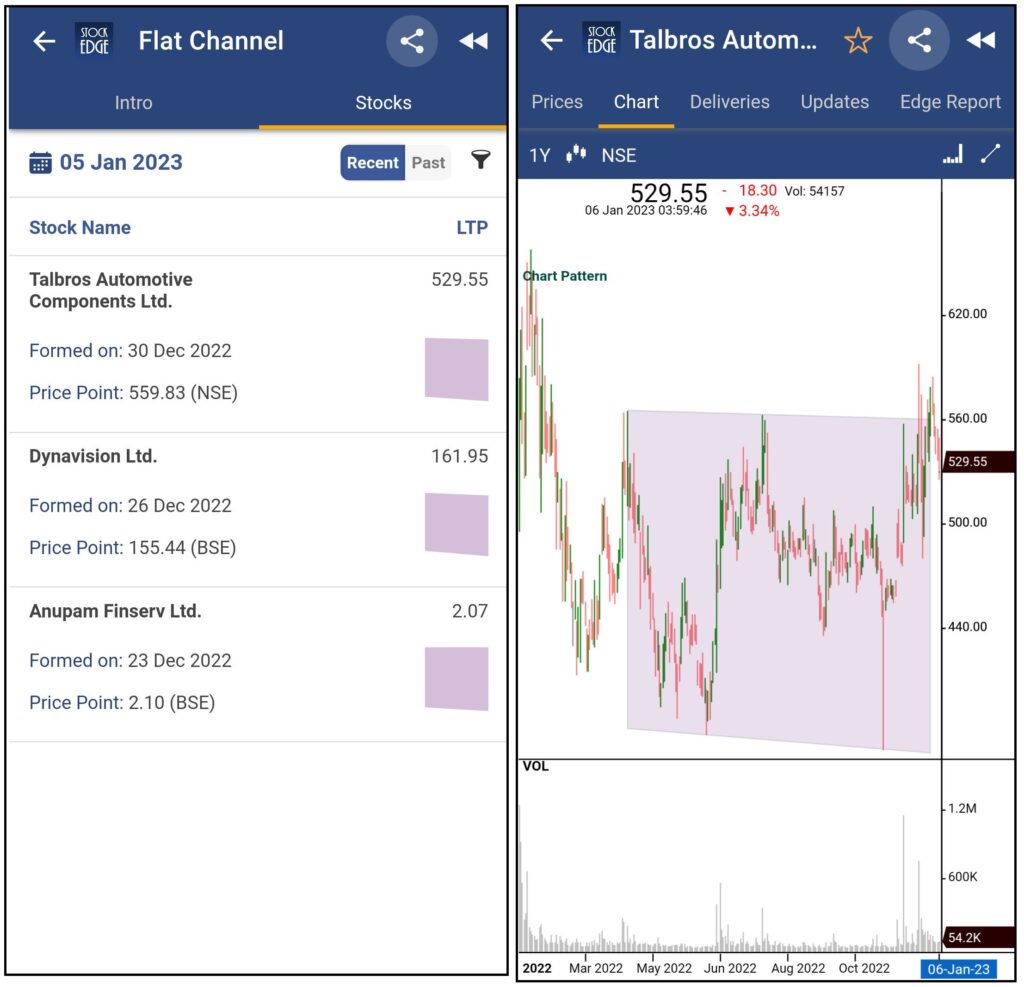
For understanding Trading Strategies and the performance of stocks forming Flat Channel patterns, Click Here.
Bottom Line
“The Goal Of A Successful Trader Is To Make The Best Trades. Money Is Secondary.” – Alexander Elder
Identifying and understanding Chart Patterns is a popular and important way to get an edge in your trading journey. It forms a key essential for keeping and enhancing yourself in the roadmap of technical analysis.
These chart patterns are a unique blend of human and artificial intelligence and thereby it provides a list of stocks that fulfil the in-house set algorithm to form the respective chart pattern types. Thereby, Investors and Traders must perform their research and understand their own risk characteristics before making any investments or trades.
Our team at StockEdge puts in a tremendous effort to deliver such powerful and meaningful features with absolute thoroughness to make every user of our product “Financially Empowered.” That being said, every user must do their research before investing in the markets.
So, what are you waiting for? It’s your time to flaunt your profitable trades on Twitter using hashtags. And hey, don’t forget to tag us this time. We would love to know and become a part of your success stories.
For using this pro feature of Chart Patterns, StockEdge has launched a new PRO Plan for the same. Click Here to start using this feature
If you enjoy using StockEdge, don’t hold back from sharing the platform with your near and dear ones.
Also, watch this space for our midweek and weekend editions of ‘Stock Insights.








Excellent solution.
this is very good analysis by case studies, very crisp and simple. keep it up